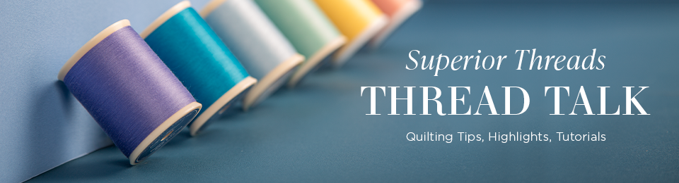
I prefer living in color… don’t you?
There are so many quilt styles these days that use thread and fabric with a high contrast. When creating a high-contrast quilt, you are faced with a decision: which color should I use? While choosing thread in high contrast quilts in a challenge for most of us, there are a few options to consider for your quilt.
Option 1:
We recommend testing several colors or shades of thread because you may be surprised what works best. Lay about a yard length of each thread choice across the variety of fabrics in the quilt. If the contrast is still too much for comfort and satisfaction, shoot for the middle and try medium tone threads. If you prefer a thread with a matte finish (to reflect less light), try out some So Fine! polyester thread from Superior Threads!
Option 2:
You can also try a variegated thread, such as Fantastico, King Tut or OMNI-V. This thread combines the best of both worlds with a quilting thread that has a multi-colored dye pattern throughout. Superior variegated threads feature consistent colors, so there is no guesswork at how the final quilted or embroidered design will turn out. For a high contrast quilt, consider a tone-on-tone thread (consisting of multiple shades of a single color. Tone-on-tone colors are preferred when the thread is meant to blend into the fabric… perfect for what we need!
Option 3:
Another option would be to try thinner thread, so it will not show up as easily (no matter what thread color you choose). When an exact color match is not available, choose the closest match with the color being slightly darker rather than lighter. A darker color will blend into a seam better than a lighter color and seem to match in a much better way than a lighter color.
To see or not to see – that is the quilter’s question!
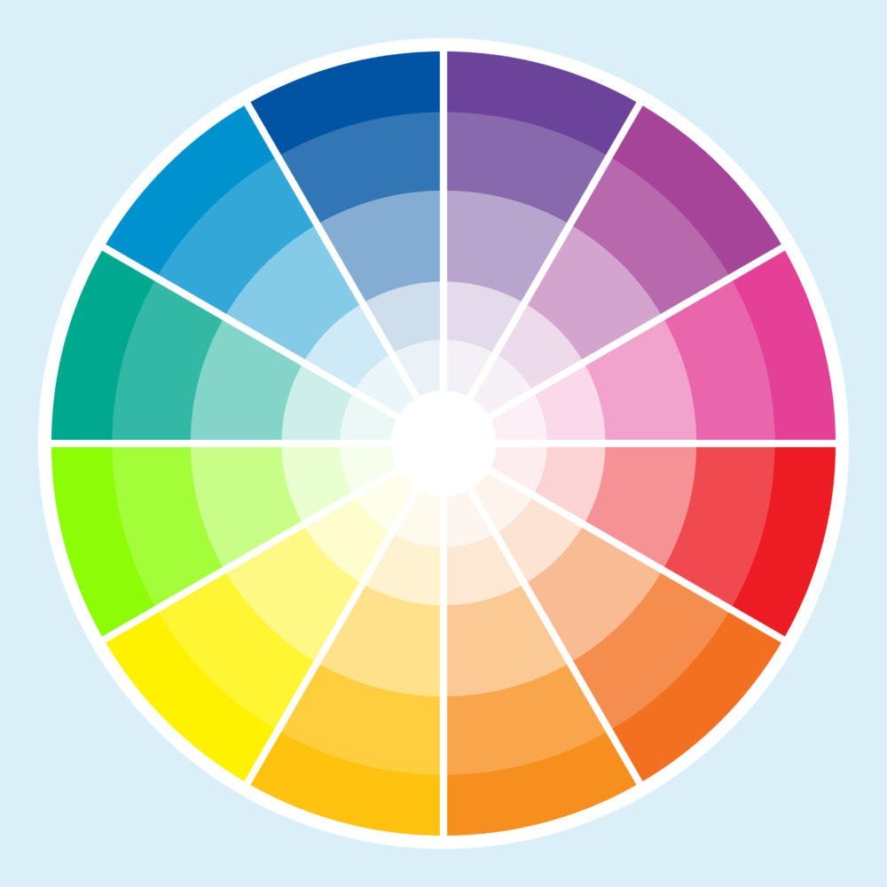
As quilters, we seem to have less of a problem choosing a thread color that values our work and highlights certain areas or shapes. Nonetheless there are certain rules which must be followed for best results and the color wheel is our best tool for this.
Color wheels can be simple and complex, but they all do one thing; they take a variety of colors and put them in groups that blend into each other. Complementary colors are the easiest to work with and sit across from each other on the color wheel. Analogous colors are more detailed than complementary colors.
Check out our color cards, wound with actual thread for a fantastic reference to utilize when auditioning thread color with your fabrics! You can also check out our color compatibility charts when shopping for Superior Thread to cross reference similar colors across thread lines!
Have fun choosing your next thread colors!